# The Data Science for Marketing
You're going to learn some phrases in this course and in your journey as a citizen data scientist for marketing that will present a barrier to communication if used as jargon. It's the dawn of a new day. Let's embrace that fact, let's advocate for it. Let's think differently and create the change in our organization to allow data driven insights to take root.
# Obtaining Data
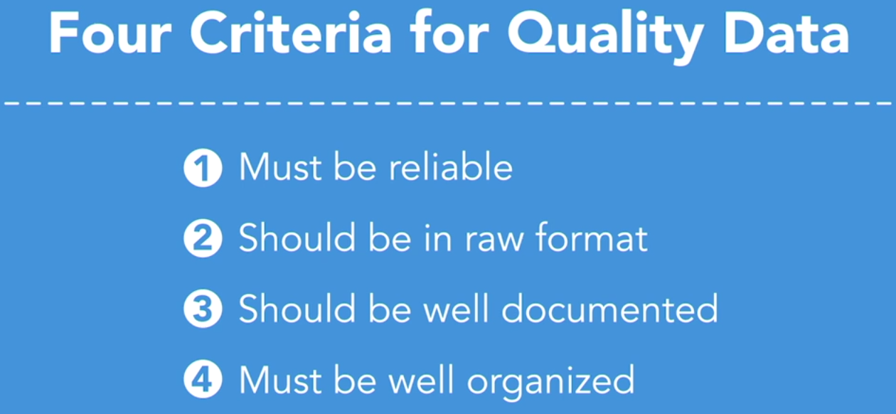
- There's an old saying in data architecture, garbage in, garbage out. To ensure the output from our data analysis provides quality insights, we need to ensure quality data. Here are four criteria that should help. Your data must be reliable. If you don't trust the source of the data, find another source. Second, you want your data in raw format.
Data with a lot of preprocessed calculations can limit your ability to understand the full picture and can limit your options for analysis. That's not to say you don't want your data source to perform some level of preparation, but be careful that those steps ahead of your data procurement don't limit what you can do with the data. Third, you want data to be well documented. In your organization, you want to specify that you have the right metadata in place, which is a set of information that describes the data itself. Similarly, we want our data to be well organized. Chances are, you're going to need to perform some amount of data organization once you have the raw data, and that's okay. It should be expected. The more organized it can be kept in the initial collection stage though, the better.
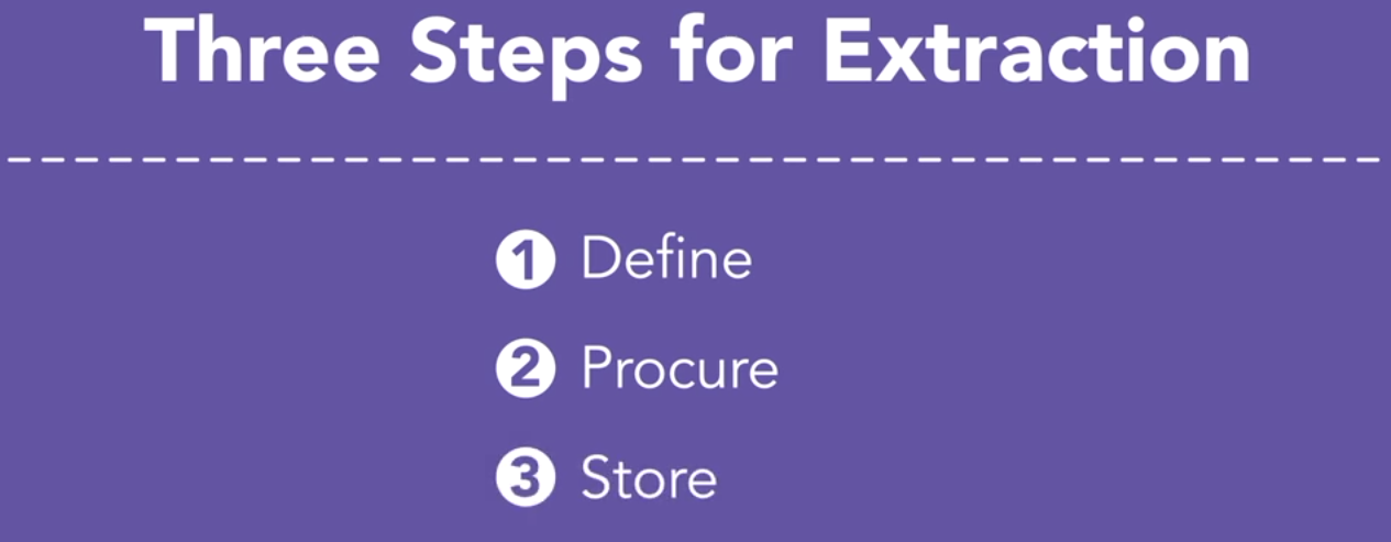
A useful acronym to know and to use is ETL. This stands for extract, transform, and load. It's the process you go through to procure and prepare your data to work with.
The right process will follow three steps. Step one, define. Define what data you need, how much, and how often. Step two, procure. Determine what data you can obtain that aligns with that definition and put a process in place for procurement. Then step three, store. Establish the necessary infrastructure to redundantly house your data. Now, in this course, you won't have to worry about this process, because I've already gone through these steps for us, but it's important to know how to tackle this stuff when you're ready.
# Exploratory Analysis with Python
For this chapter on exploratory analysis, imagine the following. You're working as a consultant for a marketing team for one of the airlines. The particular airline is positioned as a low-cost carrier with a dynamic brand full of personality. Assessing market dynamics over the past few years, you and the team have decided to invest heavily in search engine marketing, so it's important to keep your finger on the pulse of those search engine campaigns and how well they're performing.
Take a look. What would you look at to decide performance? What kind of questions would you ask?
A highly effective concept for marketing campaigns of this sort is to look at leading and lagging indicators. So you want to look at paid search impressions. This is a great leading indicator that will help us to know how many users are finding our brand and our promotions via certain keywords.
Next, we need to assess CTR, which stands for click-through rate, which will help us to understand how effectively our ads are at addressing what customers are really looking for. And we also need to assess CPA, which stands for cost per acquisition, so that we can truly understand our return on investment and our conversion.
So we just talked through a number of our TMTMTMs, or what I call, our metrics that matter the most. And again, leading and lagging indicators that help our marketing campaigns to ladder up to business impact.
You can think of the customer journey here almost like one of those board games you played as a kid. Each roll of the dice, each move you make should move you forward along the path, should move your customer and your market forward along that path. If we move our CTR rate forward, chances are we've made some informed decisions now here that will also have a positive impact on our cost per acquisition, so on and so forth.
So in the following videos we are first going to assess what you call the shape of our data. This is to say, we're going to visualize what the data looks like so that we can see if there are any patterns. Those patterns can help us to create a narrative and can help us to create an intuition for what deeper analysis and specific models might reveal. Then, in each video with each of our analysis platforms, we'll model a matrix so we can see relative performance at a high level. This is a data visualization that is indispensable to assessing marketing's impact. Remember, we're about to start a journey, and the next few videos are a great start.
First open a Jupyter notebook and bring in the Pandas package, and then I hit Shift and Return.
And that locks down that cell. Okay, so just something to be aware of. Now, something else I'm going to do real quickly too, and you'll want to do this yourself often, if you want to create visualizations within the notebook, I'm going to type in %matplotlib inline, and what this is is, it's a command that essentially allows for this notebook to list out the data visualizations inline right here on the screen on the notebook.
TIP
For Python 3.8 pip install pywin32==225, for the notebook to work.
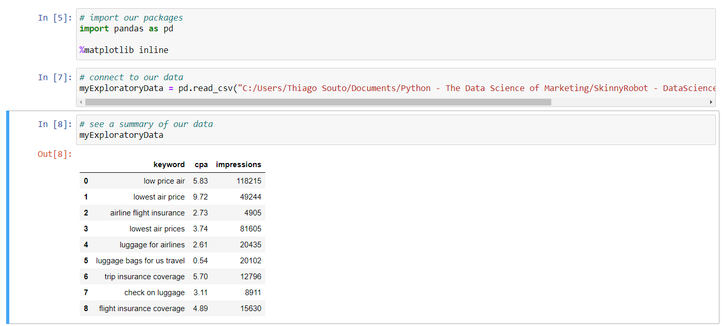
for matplotlib. That's okay, let's keep moving. We're going to connect to our data. And the way we do that is somewhat similar to what we saw when we were in R. So I'm going to create this variable name and I'm going to call it my exploratory data. And I'm going to assign that to the function pd.read_csv and then the path specifically to that data. So here, today, Desktop/Exercise Files. Now let me go grab the name for that specifically, and I'm going to open up the exercise files, so we're looking at 02_03. And I'll paste that in, and then let's grab the name of our data, which is exploratory-py.csv. And I'll paste that in. And then Shift Return. Now, similar to how we did in R, we want to visualize what we have now. So I could real quickly just grab this variable name, drop it right into this cell, hit Shift Return, and that's going to show us all of the data.
Now install seaborn with pip install seaborn or from the pycharm environment.
Then include import seaborn as sns.
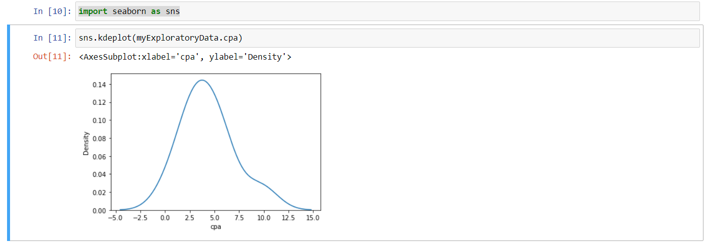
And let's visualize our data and see what we're working with here. So I'm going to type in sns, again I'm referencing the Seaborn functionality. I'm going to do a KDE plot on this data. I am going to just come up here and grab my variable name for my data, I'm going to drop that in, and you can recall that with R, to look at a subset of data, we use the operator dollar sign. Well, with Python we'll just use a dot. So we'll do .cpa, so we can see that subset of data here, and then hit Shift and Return. So that gives us a nice visualization of the shape of our data overall, so we can begin to get a sense of what we're working with.
Again, we're in exploratory mode here, we're just trying to get a sense on what we have to work with. Now what I'd like to do is find out where most of the impressions and where most of the spend for those impressions is occurring. I would like to leverage the data that we have to help to tell our client that piece of information.
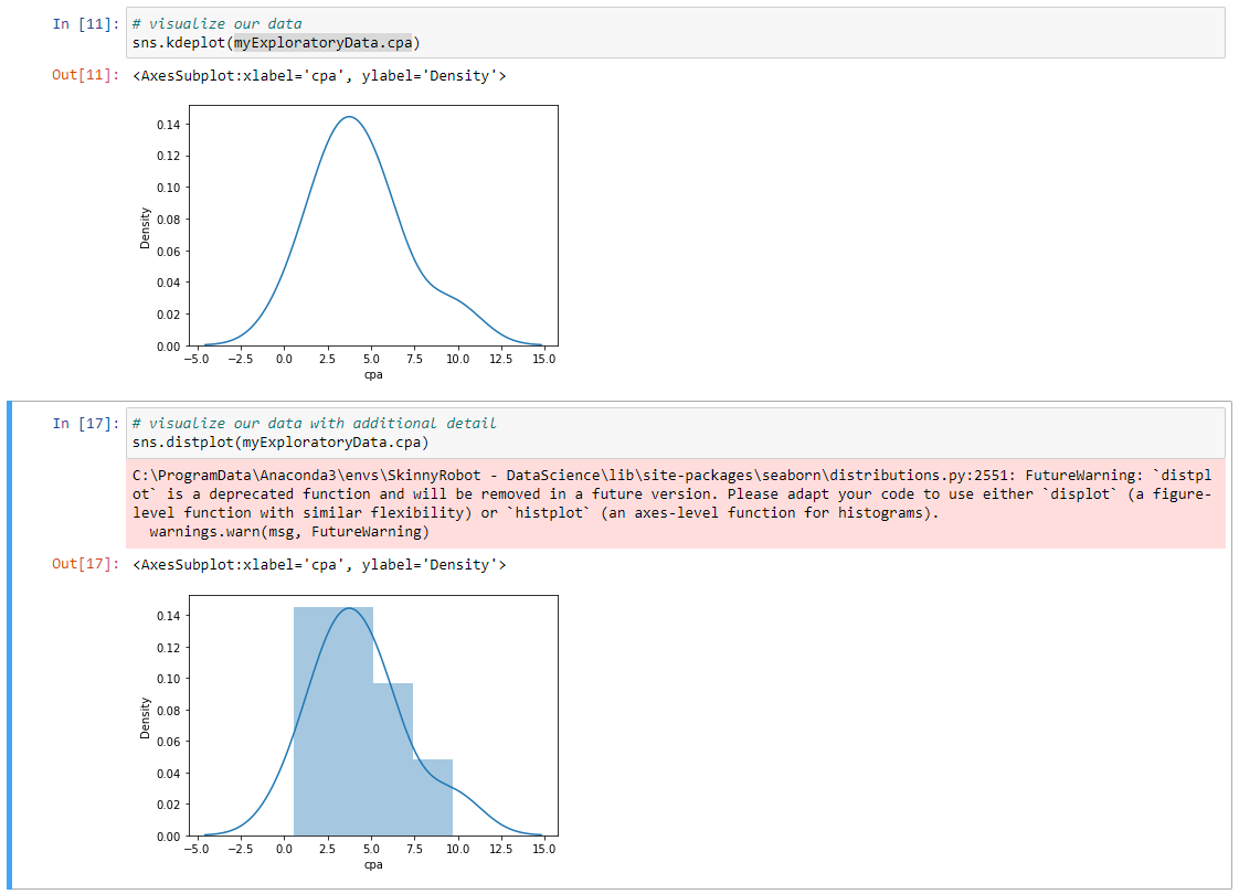
So again, we need to do a bit of a pivot table or transform our data a little bit to allow for us to create that specific visual. Now, there are times where we might want to see some additional detail in our data. So we have our distribution plot we can look at here, and we can use that with our Seaborn package. So I'm going to type in sns.distplot and go into copy in our variable name for our data, and look at the subset of cpa like we did before, and Shift Return. Now this time around we can really get a little bit better clarity on where our spend is occurring.
So in this visualization, it might have been hard to tell how much was between 10 and $15, and now we can see that there's really not any bend there. So again, just exploring right now.
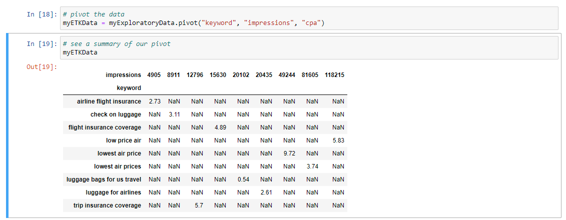
Now we want to pivot this data, because what I want to really do is I want to be able to find out where the most impressions and where the most spend is right now, so I can pivot this data.
Now what I'm going to do here is I'm going to set up a new variable called MyETLData. I'm going to assign that to myExploratoryData, and do a pivot command on it, and I'm going to pivot this data by keyword, by impressions, and by CPA, and I'll Shift Enter, and if we wanted to take a quick look at that pivot, all we would have to do would be, well, I'm just going to copy and paste that variable here just to make it easy, and then Shift Enter, and then that gives us a sense on how we pivoted that data.
So what we're now looking at are specific keywords, and we're looking at the overall cost and the number of impressions. So this is going to allow for us to create a heat map that has some very specific insights as a part of it. So let's visualize that data, and I'm going to do so again with our Seaborn package sns.heatmap, is the command, and then I'm going to again leverage this specific variable name and enter that.
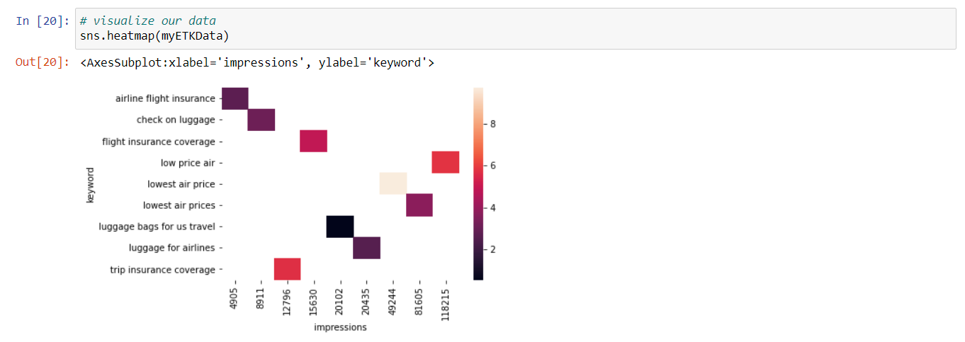
Now we have a data visualization that helps us to see really a few different things here. So we can get a quick sense as to the overall cost, so we know that the darker the color is, the more that particular keyword costs. And the lighter it is, the less it costs. So we can see luggage bags for US travel is costing us the least, and we can also get a clear sense, too, on what the overall activity is or the impressions are. And that runs along this continuum. So anywhere from 4,905 impressions to 118,000, roughly, is what's in our data. And really, this can help us to now see where our lowest air price, you know, that particular keyword, this lowest air price keyword is really the most expensive and it's providing a lot of impressions. And again, this can provide some trailheads for how we optimize the data, for how we optimize our campaigns, to help us to derive greater yield from those campaigns.
So that's awesome. You've created a data analysis using Python. Something I like about the language is that the conventions it uses, like .syntax, are a bit more in sync with other languages that you might need to use in your work, like JavaScript, for example. And everything is right here, in this one place, and it's easily sharable and editable. And with that, let's power down Python so we can move on to our first analysis using Tableau.
# Exploratory Analysis with Tableau
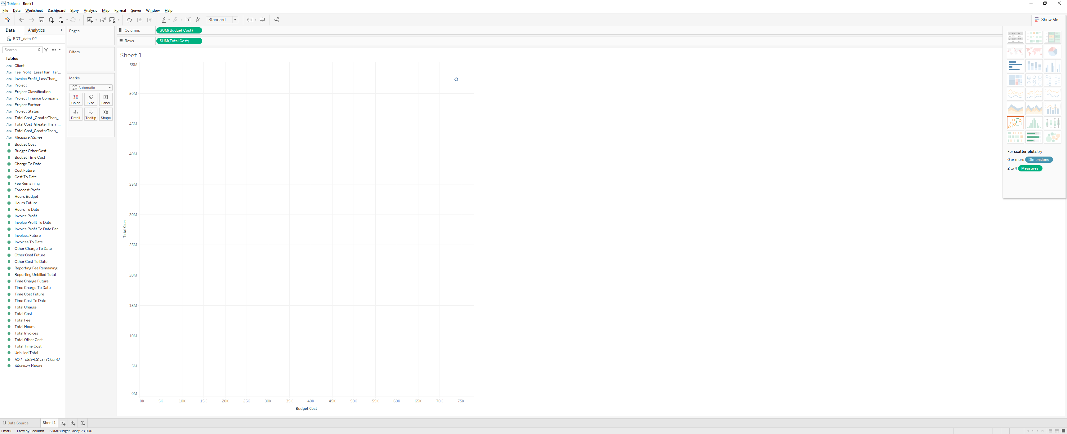
To use tableau afoter instalation, we will actually connect to our data, from the left panel. There's the open section here in the center, and that allows us to review open workbooks in the Tableau community and then on the far right side there is the discover pane, with access to other data visualizations and resources that we can take a look at. Now, I'm going to go ahead and click on text file and connect to some data, let's navigate to our desktop and to our exercise files, and choose 02 04, and select exploratory Tableau. So again, this will help us to see our data. And then if I click on sheet one, now we're in a Tableau workspace. On the far left side, you can see that this is our data, this is the data we were just looking at in the data source window, actually let me click back on that tab real quickly, so we can see our data.
So here we've got key words, campaigns, clicks, and again if I come into my sheet, you see that same data organized here, so we've got data listed out as measures, and measures our numeric data, and then we've got our dimensions. And the dimensions are what our measures are categorized by.
Moving over to our right, we have our marks card, and our marks card allows for us to really take control of the different aspects of our visualizations. So we can change color, we can change the font face, we change the different sizes of our visualization. Moving over to the right even more, we have our two shelves. We have our shelves for our column data, we have our shelves for our row data, so these shelves house the data that we're looking to visualize. So let me give you a quick example, I can simply drag clicks into columns shelf, and I can grab our Ctr and drop that real quickly into our row shelf. And so this helps us to begin to visualize that data.
The last thing I'd like to point out, in terms of the Tableau interface, is the show me palette. So, this can be found on the right side of your screen, so I'm going to move my mouse over here, and I'm going to click on show me, now what this reveals is a number of different data visualization types that I can apply to my data. And we'll see that come to life more as we go through the course. So there's your overview for Tableau. Now let's go ahead and shut down out of this. We don't want to save this. The good news, is that in just a little bit of time, you now have a high level understanding on how to get around these applications. If you can open, navigate and close these different applications, then you're well on your way to becoming a citizen data scientist and for tackling the rest of this course. Congratulations, let's move on.
# Exploring data
- [Instructor] I think of Tableau in a similar vein as Photoshop. They're two totally different programs that do two totally different things, but what I mean is that Photoshop is a critical tool for certain aspects of design and photography. Tableau is like that for data analysis. It's a go-to kind of tool. There's a lot it won't do, and that's why we have included the other tools in this course. But for what it does do, it does a pretty awesome job at it. I already have Tableau open and ready to go here and we're going to connect to our data so I'm going to click on Text File to connect. I am then going to navigate to our Exercise Files and I'm going to click on exploratory-tableau.csv.
Click on Open, that takes a second, and it's going to bring our data into the Tableau environment. Now that we have our data in, we can take a quick look at what we have. We can see that we have Keywords, we have number of Clicks, we have Click-through Rate, Conversion Rate, Cost Per Action, and the number of Impressions for each of those keywords. So that looks good, and now let's click on Sheet 1 where we can begin to visualize this data. So one of the first things I want to do here is I want to grab the Keywords dimension and I'm going to drop that onto our Rows, so now we can see our Keywords here. Now, I want to grab the Impressions from our Measures and just drop that onto our Color Marks tab. So pretty much instantaneously, we can see a heat map for this data so ultimately this is showing us the impressions for each of these keywords. So if I just mouse over here, I can see for Low Price Air, 354,000 impressions roughly. And then a lighter color, less impression. So Ticket Best Price, roughly 274,000. So again, it's a great tool for doing this kind of exploratory analysis really quickly.
# Inference and Regression Analysis
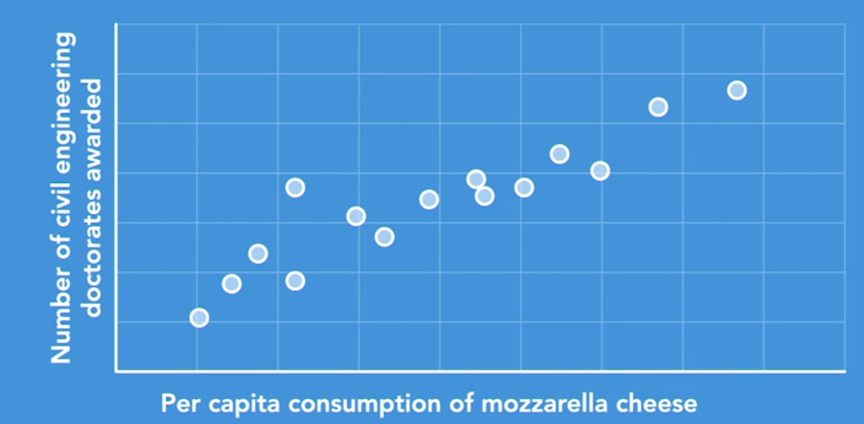
Have you ever noticed how one thing can somehow influence another? In other words, two items or two events can be correlated. For example, ice cream sales go up as the temperature goes up. Remember however that correlation does not imply causation. For example, there's a strong positive correlation between per capita consumption of mozzarella cheese and the number of civil engineering doctorates awarded, but that doesn't mean that cheese consumption affects the affinity for postgrad academia in civil engineering.
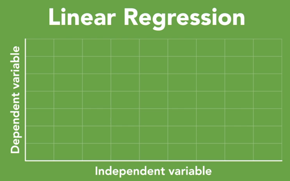
Regression analysis is a primary statistical technique in understanding the relationship between things. In our case, those things are marketing output and business outcomes. In this course, we'll focus specifically on linear regression. In linear regression analysis, we assess at least two data points, an independent variable and a dependent variable.
Dependent Variable
A dependent variable is a thing that may be influenced by some other thing. A rainy day often means umbrellas are being used. In this case, the use of the umbrella is the dependent variable. Its use depends on it raining.
Independent Variable
An independent variable, on the other hand, is a thing that might influence some other thing. It does the influencing. So in the previous analogy with the rainy day, the rain is the independent variable. Think of it this way, it's going to rain whether folks choose to use an umbrella or not. It's independent.
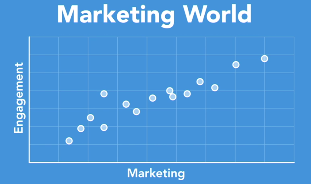
In the marketing world, there's a similar dynamic at play. The more people that experience your marketing, see a television commercial, for example, the more interest and the more engagement there is with your brand. So in this case, the amount of marketing is the independent variable and consumers' attention is the dependent variable.
Now, let's get to work. Imagine that I'm walking through a casino in Vegas with one of my clients. We're on our way to the MAGIC show, which is a biannual event where all the apparel brands go to show their fashions for the upcoming season. So you've got brands from Nike to Quiksilver and they're all there, making deals with their current customers and creating new ones. This is how most clothing makes its way onto the clothing rack in your favorite store.
My buddy stops at the roulette table, drops $100 on red, and it's the equivalent of a coin toss. It's 50 50 odds. The wheel spins, it lands on red, we have a winner. Luck is on our side. And this win has my client feeling bullish and as we continue to make our way to the exhibit hall, we discuss plans for a Times Square takeover campaign. This is a big investment, but it's a competitive business, and the winners have to make big bets to build consumer perception that drives demand. It's our job to make sure those are safe bets as well.
Our client in this branded lifestyle space has made similar investments in the past and we have some really good data on hand to analyze, data that will help us to see what sort of response we have achieved using different channels, like broadcast media, out-of-home billboard, for example. Our assignment is to leverage that data to clarify the impact on those investments.
Now, regression analysis is really going to be our friend here. What it allows for us to do is to find those relationships between those marketing outputs and the business outcomes that we need. So, what we're going to do in the next few videos is look at how to model this data. As a result, we'll be able to provide advice to our client to help them make the safe bets to drive returns without having to just get lucky. Let's face it, marketing shouldn't be about gambling. We have the data to ascertain luck.
# Regression
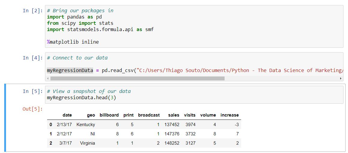
We're going to build on what we learned in the last video. Now with Python, we've gone ahead and we've opened up the application, and we've set up our notebook by bringing in our packages. This time there are a few of them. Go ahead and execute this code by running the cell. If you recall, we'll select that cell and then shift + enter. This has brought our packages into the platform and has set us up to begin our work with the analysis here. Now let's connect to our data source. In this case, we'll be connecting to our CSV file. Again, we've already written that line in, and we're just going to go ahead and run it with a shift and a return. Let's see a quick snapshot of our data, just to insure we have access to what we thought we should have access to. I'm going to type in this variable that we assigned to our data frame here. I'm going to run the command head(), and I'm just going to input three here as a configuration. That'll just give us the first three rows of our data.
You can see we got something very similar to what we saw in the last video, in terms of our dataset. There have been a few transformations to this, so we don't have quite as many data points or quite as many columns here, but the general gist of what we have here is very similar. That looks good. Now let's plot our data.
Similar to the last video, we're going to assign broadcast to our X axis, which is synonymous with what our independent variable is, and we will assign sales to our Y axis, which is synonymous with what our dependent variable is. Let's go ahead and plot that data. The way we do that, I'm going to go ahead and paste in that variable name from our data frame, and I'm going to run the plot() function, so dot plot. Now we need to specify which type of plot we're going to run. We do that by typing kind, in single quotes, scatter, so it is a scatter plot that we're running here. Next, we want to assign the data for our X axis to broadcast. The way we do that is X equals single-quote broadcast, which we can see right here is the name of that specific column with this dataset, and now Y equals sales, and again we can see that in the printout of our data above. With that, I'm going to go ahead and run this. That brings a data visualization into our notebook.
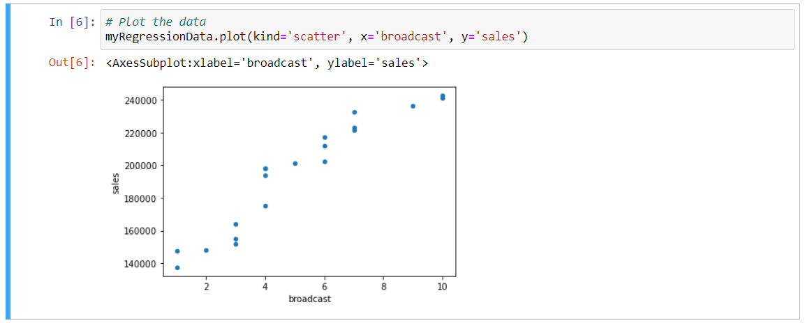
This is a scatter plot, just like we saw in the last video. Before I do any additional analysis, I want to introduce a new concept, that of R squared. R squared is a statistical measure of how close the data is to that fitted line. It is also known as the coefficient of determination. R squared values are always between zero and one, but let's interpret that as between 0% and 100%. Zero indicates that we can infer no correlation between our dependent and independent variables, while 100% means that we can infer a significant correlation between the two. In general, the higher the R squared, the better the model fits your data.
I have already included the line of code that you will need here.
What this is doing, this particular line right here, what this is doing is it's feeding our stats package algorithm that we included in cell one above. It's feeding the values that it needs to calculate R squared, so that it's taking the slope and the intercept, for example, and it's using those as inputs into that algorithm. We of course need to assign our X and our Y values, which we've done right here, with broadcast and sales. Let's go ahead and run that command. Then we'll print out R squared for assessment.
We type out Python's print() command, which is simply print and then parentheses, and I'm going to type in, we can type in whatever makes the most sense here as a label, so I'll just do R squared colon. This is where we're going to print out what the R squared value is, and then I'm going to feed that R underscore value, two asterisks for an operator, and the number two. That's how we calculate R squared. Let's go ahead and run that. This value indicates a relatively strong relationship between our broadcast advertising and sales, so it's another way to interpret the model.
# Calculate r-squared
slope, intercept, r_value, p_value, std_err = stats.linregress(myRegressionData.broadcast,myRegressionData.sales)
# Print the r-squared value
print("r-squared:", r_value**2)
2
3
4
r-squared: 0.8999615221079124
Now, let's create some parity between what we're doing here in Python and what we did in R. We can also calculate the coefficients here. We can do so by running an OLS, or what's known as an ordinary least-squares regression, which is what we did in R. We do that this way. Let me go ahead and type this in here. I'm going to assign it a variable name of myLinearModel, equals, and then I'm going to type in smf.ols. This is assigning the myLinearModel to the command from our stats model package, so that's the smf, and then the ordinary least squares component of that, so I'm going to add in a formula, and assign this formula now. We're going to assign it our dependent and independent variables, so first for the dependent, so that's going to be sales, tilde, and then the predictor, which is broadcast or our X value or our independent variable there, so sales tilde broadcast, and then we need to assign it our specific data frame, which again, from above, that was myRegressionData, and then we want to assign the fitted for that fitted line. Let me run this. That information is there; we just need to reveal it so we can output those values this way. I'm just going to call the variable here and then run the params() function on that. That will basically reveal the parameters that are nested within this myLinearModel variable here, so enter that.
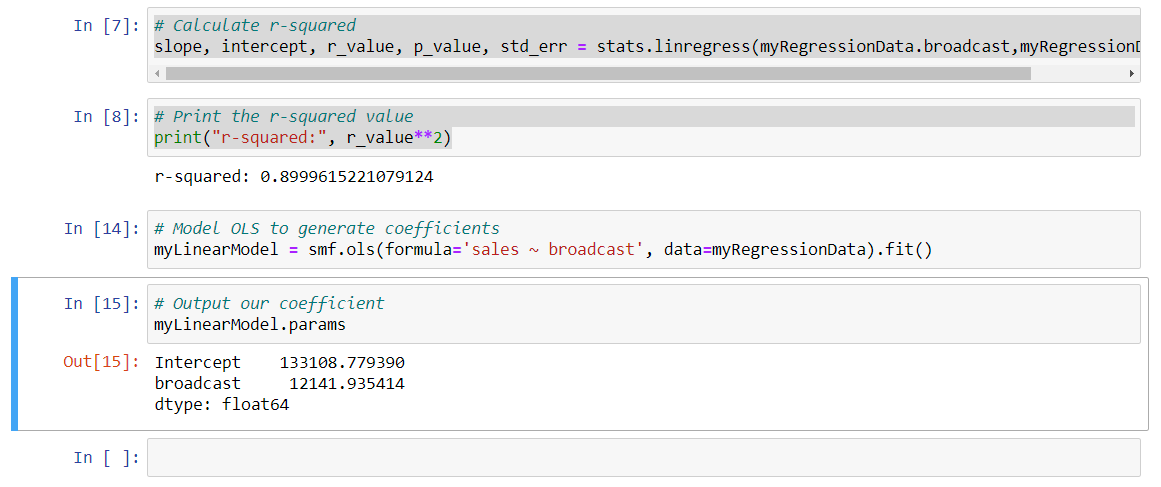
We have values here that are similar to what we saw in our regression in R. This says that for each increase in broadcast unit, there is an increase of $12,141.93 in net sales. So we've done a couple things here. We modeled our data, we generated and assessed R squared, and we ran an OLS regression analysis to determine the relationship with some specificity. We now have the necessary information to begin to model our broadcast's return on investment.
# Prediction (Decision Trees)
in this chapter, I'm going to teach you a popular machine learning technique for predicting events and outcomes called decision trees. A decision tree takes a set of data and it splits that data continuously until it has a predicted outcome.

How many times have you heard someone say, "If I only had a crystal ball, I could predict the future"? Well, we're going to do just that, and walk you through the process step by step so you can grasp exactly how to go about it.
Now brick and mortar retailers in the US do an estimated 4 trillion in sales each year. That number might be surprising given the power of e-commerce these days, but old school retail is still a significant economic engine. To that point, in this chapter, we're going to help a retailer determine where their next store and expansion of the retail business should be located. And we're going to do so using, you guessed it, prediction.
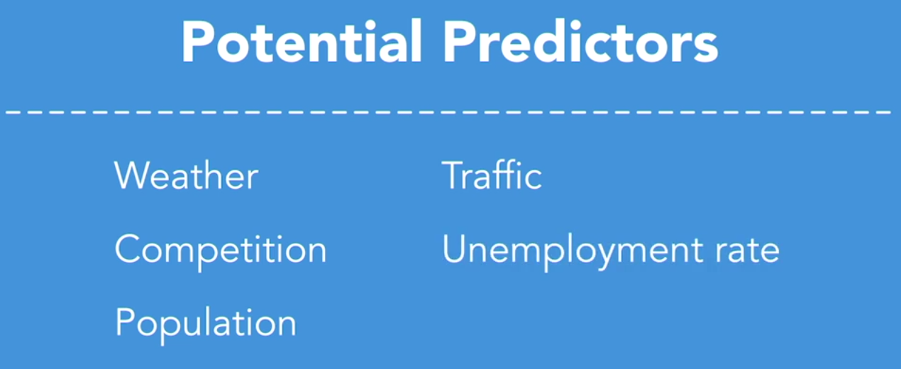
What our prediction algorithm is going to do is assess the ability for different predictors to influence the outcome. In the case of our retailer, the potential predictors that we have available to us in our data set are weather, the radius of complimentary establishments, the population, the number of cars that drive by each store, and the unemployment rate for the store's geographic location.
These predictors can help us to understand the conditions necessary for our retailer to make a safe bet on their next location. We just have to figure out which ones matter. So, let's get started with our prediction analysis. These predictors can help us to understand the conditions necessary for our retailer to make a safe bet on their next location. We just have to figure out which ones matter. So, let's get started with our prediction analysis.
# Prediction with Python
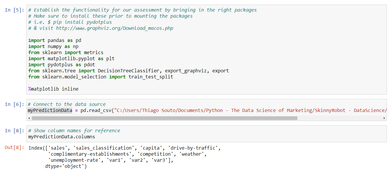
Let's jump right in. We're going to set up our decisions tree in Python, and so I've already declared our package statements and the first cell, we'll be bringing in pandas and numpy. These are two packages that you'll experience often if you do a lot in Python. We're also bringing in pydotplus, which offers some additional functionality for graphing, and we're bringing in sklearn to help split our data and create our tree. My machine already has some of these pre-installed and you'll want to install them as well and to do so, visit the link on the screen and follow the instructions found there.
So, let's run this line, and next let's connect to our data source. So we'll make sure that this cell is selected and we'll go ahead and shift enter, and let's go ahead and print out our column names, just for, just for easy reference, it's always nice to have these available when we might need them, so I'm going to type in the variable for our data frame, which is, my prediction data, and then the columns command from there and then we'll run that, and this simply gives us a readout of those different columns names right there.
Now, our cross validation function loaded in at the beginning of our notebook file provides the algorithm that we need to manage our data for this example. And if you recall, I mentioned in our overview video, that a decision tree takes a set of data and splits that data continuously until it has a predicted outcome. Now further we can split our data to help fit out model, and we'll do so with what is known as testing data and training data, because this way we can run a few tests to assess whether our model holds. So this is a good chunk of code, and I've already loaded that in there, and you can see that we've assigned our predictors to a variable called feature underscore cols. And that's where you see capita, competition, weather, var1, 2 and 3, those all being assigned. And then we assign our sales classification column to the y. So let's go ahead and shift enter, and if you'd like to use this code for your own data, you'll just want to replace the column names to line up with your own. So shift enter.
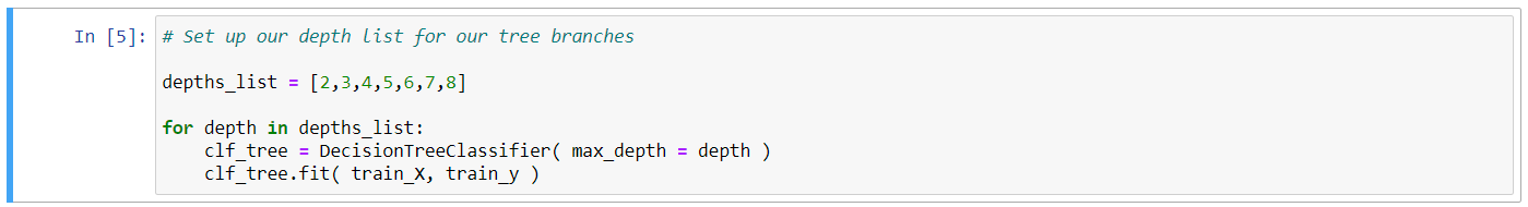
Next, we'll assign a list of different values our algorithm can use to model the different branches of our tree, and that's where you'll see the numbers two through eight, this means we can model the output of our tree to show, anywhere from two branches to eight branches, in other words, this will show up to eight possible branches to predict our outcomes. So I'll run this with a shift enter.
And let's go ahead and, we're going want to specify the number of branches for our tree, so we're going to declare this with a name clf tree, and that's going to equal our decision tree classifier, and we're going to assign that a max depth of eight. Now this is a number we can update if we want to see anything less than eight. So let's run that.
# Specify the number of branches for our tree
clf_tree = DecisionTreeClassifier (max_depth = 8)
2
And we're going to fit our training data to the x and the y, so we're going to take that value that we just assigned in terms of clf underscore tree, and we're going to fit that both to our train data for the x in our train data for the y, which we declared above, and run that. And just run that algorithm for us right there, and some output there.
# Fit our training data to the x and to the y
clf_tree.fit( train_X, train_y)
2
DecisionTreeClassifier(max_depth=8)
And we're going to apply our test data to our model, so we're going to do that by naming this tree predict, and calling it our clf tree, which now houses the output for our algorithm, and we're going to call the function for predict, and then test underscore x, and run that.
# Apply our test data to our model
tree_predict = clf_tree.predict(test_X)
2
Now we can output our tree and this code leverages our graphing package to generate an image, and then shows that image in line right here in our notebook. So we're going to go ahead and run this block of code. And if you recall from a second ago, we assigned eight branches, so that generates quite a few options, and so many options really, that it may be difficult for us to provide a clear recommendation.
TIP
Use python 3.7 for this example
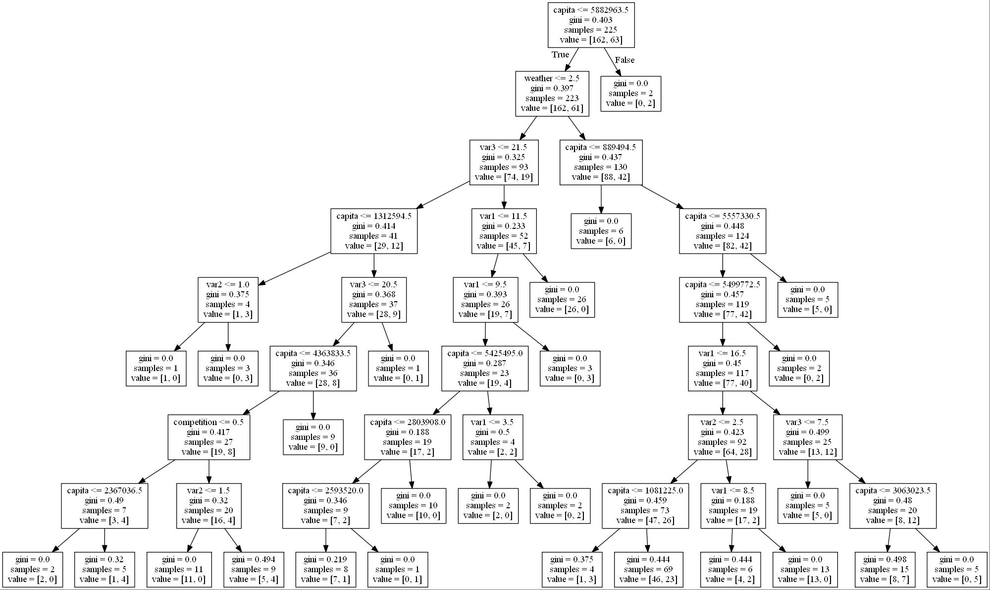
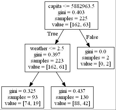
So let's have our algorithm narrow this down for us. If we move back to that next depth declaration, I'm going to change it from an eight to a two. Re-run that, and then re-run our data visualization.
# Specify the number of branches for our tree
clf_tree = DecisionTreeClassifier( max_depth = 2 )
2
And now that we can see that we have something that provides us with a little bit more clarity, we can see we have a tree here that looks at overall capita, and looks at our sales output, assigns that, anything less than or equal to this capita number, generates the sales classification that we're trying to drive, and then it does another branch here and looks at specifically, the next level of capita and helps us to really identify what our prediction is. Again, this approach will allow for us to run multiple tests over time, to gain further confidence that our prediction is accurate.
TIP
Gini index or Gini impurity measures the degree or probability of a particular variable being wrongly classified when it is randomly chosen. But what is actually meant by 'impurity'? If all the elements belong to a single class, then it can be called pure.
# Cluster Analysis
Think about your closet at home. Do you keep certain types of clothing like T-shirts or dress shirts, jeans and slacks, organized into groups or is it a mishmash? How about a sock drawer, do you have one of those? Whether you keep things organized in groups or not is your own personal preference, and this is certainly not intended to be a critique on your own personal organizational habits. To each their own as they say, but the idea of a sock drawer, the concept of all things in their place as they say. Those sorts of organizational devices help things in general to stay organized, to stay efficient. Need a pair of socks? Well if you have a sock drawer, you know where to go. Now, we do this kind of thing all the time, right? We sort similar things into groups, so we can make sense of them. This is what cluster analysis is all about. Sorting your data into groups.

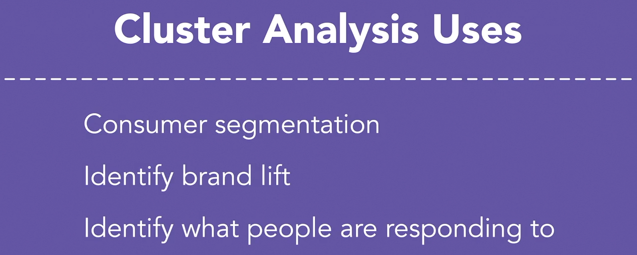
Now, this is actually a very powerful concept when applied to marketing. In the marketing world, we talk about market segments, and competitive sets, and business units, or brand extensions. All these ways in which we refer to our marketing strategy are organized into groups. Each of the different types of cluster analysis algorithms group data based on certain variables. In other words they create and organize your data into different buckets. This can be used for consumer segmentation, or to identify which types of ad units are driving the greatest conversion or brand lift. It could help you to identify what people are responding to.
could help you to identify what people are responding to. Our cluster analysis case study comes from the world of consumer packaged goods, CPG. You might imagine the client is a popular beverage brand, or a challenger brand in the personal care space. They have come to us seeking our guidance on their segmentation strategy. Now, take off your marketing hat for a moment. How many times in your lifetime as a consumer have you experienced an ad that was irrelevant to either your taste or your needs? It happens a lot, and it can be annoying on a personal level, and it can be a real waste of marketing dollars on a business level. Now, put your marketing hat back on. One of the great things about technological advancements in the marketing space is the ability to target your message to those that it will find the most resonance with. Marketing can be extremely valuable to the right customer, and providing that value can in turn drive revenue, and that's what we want.
So, how do we go about doing this? Well, we have to determine where our marketing will provide value. Where it will be welcomed and be useful. We need the right message being delivered at the right time to the right person. So we have to understand which groups, what are known as consumer cohorts, represent which portion of the market so that we can evaluate and prioritize. This approach can also inform our messaging and our creative with consumer insights.

So, the way we go about doing this is with cluster analysis. For example, imagine our CPG client leverages email marketing as one of their channels. Analysis has shown that the right kind of personalization in email messaging can dramatically improve performance. We might have a large group in our database with families, and their needs will likely be different from other groups. Safety and wellbeing for example might resonate most with this group. That same database might have a large group of recent college graduates, and value might resonate most with them.
So you see, I'm talking a lot about groups. Our client may have millions of customer records in their database, and if we can organize that information into the right groups, we can do marketing personalization at scale.
# Cluster with Python
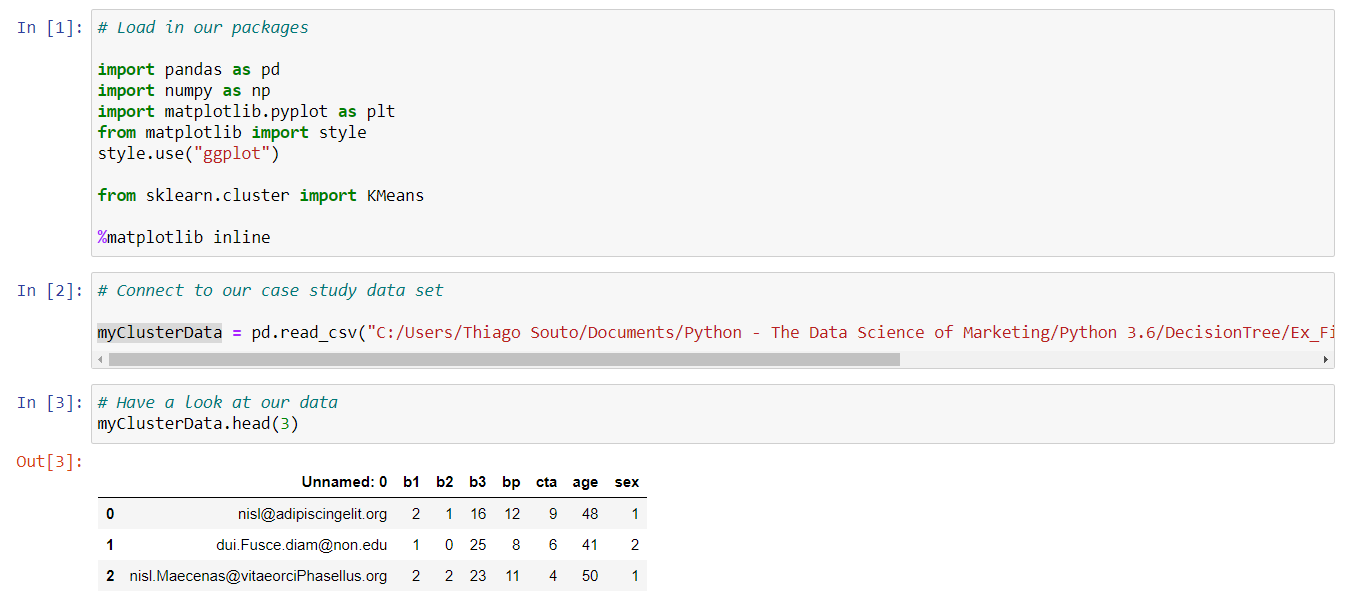
We're going to crack the hood a little bit more on this overall concept. So, I've brought our packages in. Some of the usual suspects you've seen before in this course and you'll often use some of the pandas, numpy, netplotlib. There's also Archian's Algorithm. There are two different approaches our cluster analyzes can take, there's a flat cluster, which is where you can specify how many clusters you want. And there's a taxonomy clustering where the algorithm decides for us. Our algorithm here, takes the former approach. Similar to what we did in OR, we're going to specify how many groups are made. So let's go ahead and bring our packages, so I'm going to shift, enter here. And let's connect to our data, so I'm going to select this second cell and shift, enter. And let's have a look at our data now real quick. So I'm going to type in myClusterData and the head command and pass in a value of three so we'll get three sample rows from our data set.
So that looks good, now there's a new concept at this stage of the game that I need to introduce. The fact that numerical data can be categorized as either continuous or discreet. So a quick definition for each. Continuous data can take any value within a range. A cost per acquisition is a good example because it can range from only a few cents to hundreds, if not thousands of dollars, depending on the business case. Discreet data, on the other hand, can be grouped into buckets and there are a finite number of them. So the number of creative executions in a campaign is a good example because generally these are limited and categorized in some way. Generally speaking k means is going to provide the most value when you're working with continuous data. Let me give you an example, let's go ahead and plot two of our columns from our data set. I'm going to plot b1 and b3, so I'll do that with the plot command and we'll generate a scatter plot. We'll call in our data here and specifically our subset b1 and then we'll plot that against b3. So my cluster data.b3 and let's go ahead and show that plot with the plot command, plt.show and shift, enter.
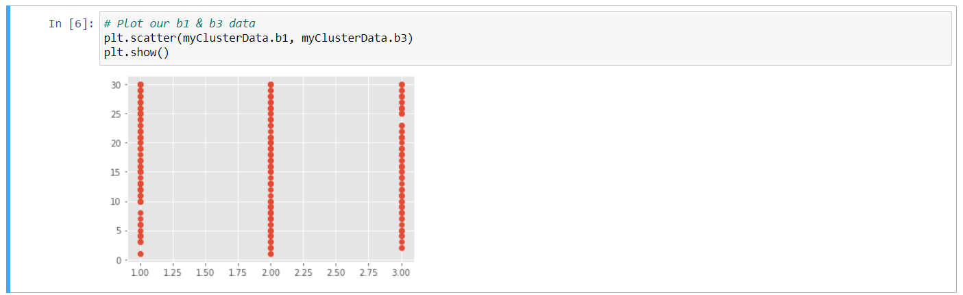
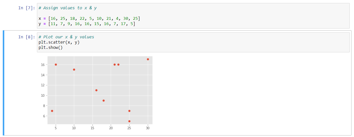
So, what we're seeing here shows us that the data that we just plotted is discreet. There are a finite number of values in these two columns. So this would not be a great candidate for a k means. Again, we're going to get under the hood here. So instead of just calling our data in, I've gone ahead here and explicitly stated the data so that we have an array of numbers for x and another for y. This is a small sample from our b3 column on the x and cta for the y, so let's go ahead and run this.
# Assign values to x & y

x = [16, 25, 18, 22, 5, 10, 21, 4, 30, 25]
y = [11, 7, 9, 16, 16, 15, 16, 7, 17, 5]
2
3
4
And let's go ahead and plot these values now. So I'm going to type in plt again and we want to see a scatter plot and we want to see that scatter specifically for the x and the y values that we just loaded in, in the previous cell. Let's go ahead and show that and shift, enter. So, here we can see in our plot that we have a bit more variety, our data seems to be much less categorical. And we can see what appears to be these random groups. This is the shape of the data that tends to work best for a cluster analysis of this sort.
Now, I've gone ahead and sorted the data from our x and our y values from above. And have organized those into this two-dimensional array that you see here. Now, we did the same sort of transformation on the data in r, it's just that our algorithm managed all of that for us. And here again, what we're trying to do is pop the hood a little bit so you can see a bit more of what goes into this process to create these groups. So let's go ahead and run this, to load those data points in.
# Pivot our data to work as an array
X = np.array([[16, 11],
              [25, 7],
              [18, 9],
              [22, 16],
              [5, 16],
              [10, 15],
              [21, 16],
              [4, 7],
              [30, 17],
              [25, 5]])
2
3
4
5
6
7
8
9
10
11
And now let's write a set of procedures that are going to do a few things. We're going to specify how many clusters we want our algorithm to generate. We're going to run that algorithm, we are going to assign our centroids because I'd like to visualize those, so you can see how those work. And then, we're going to label our group names. So well, let's go ahead and declare our variable called my groups in and tell our k means algorithm package that we want three clusters. So, to do that, we're going to do something like this. We're going to do myGroups = KMeans: that's from our k means declaration above, and we're going to specify the number of clusters by typing in n_clusters and we're going to specify three. Let's now run that algorithm, so we type in myGroups.fit and we're going to pass it, that value of x, which is what we called our two-dimensional array above. Next we're going to create a variable that takes the output from our algorithm and assigns the centroids. Now we mentioned those in the OR video, but now you'll be able to visualize them. And when we visualize the output from our algorithm, you'll see them as visualize on the screen. So we type centroids, that's declaring a variable to this command of myGroups, assigned to cluster centers. So that takes the cluster centers attribute and we generate those, and now let's assign the labels from our definition of myGroups above. So we'll do that with labels = myGroups.labels_ and we'll run this.
# Assign the value of n clusters / run the algorithm / assign centroids / label our group names
myGroups = KMeans(n_clusters = 3)

myGroups.fit(X)

centroids = myGroups.cluster_centers_

labels = MyGroups.labels_
2
3
4
5
6
7
8
Our next cell creates a for loop and it plots each point on the graph. So, all the commands that we just wrote, this set of code here will essentially allow for us to visualize all that. So then it plots the centroids so we can see those again. So we've declared a color palette here. We have then this for loop that will go through and plot each of our data points and then we'll visualize those centroids. So, I'm going to go ahead and run this. So, X marks the spot, and we can see that each of our three groups are organized around their respective centroids, which is the mean in k means. It establishes the best fit by calculating and declaring the most efficient mean for the number of groups we told it to create. In a later video, we will discuss the best practice of running market tests. And the output from our clustering algorithm can provide us with a hypothesis that we can test. Which would be the next step in determining the efficacy of our segmentations.
# Conjoint Analysis
I love a good story about a startup company. When Airbnb started out, it was called AirBed and Breakfast, for example. You could rent an airbed on someone's floor and the owner of the home would provide breakfast in the morning. The idea didn't take off in its original incarnation and the founders had to actually sell breakfast cereal, of all things, to keep the company afloat. Today, obviously, they are a roaring success. The number one reason startups fail is due to lack of interest from the market. Remember that market may have intended to be, or could've accidentally become. They create a product or provide a service that the world simply doesn't want.
So, how do you know if a startup is creating a desired product? A great way to know is to ask the market itself, to conduct a survey, or to observe consumer behavior.
In our example, let's assume we are working for a startup organization, one that is interested in becoming the leader in the next wave of social media applications. Their premise is simple. They know certain features are critical, but certain features have yet to be invented. Now, these new features will take the social media world by storm.
So, we have created a consumer survey. The survey categorizes the certain types of functionality into buckets like photos, user experience, and the ability to share content.
We then identify the features that can comprise each category and have asked survey respondents to rank, or weight those features that they find most exciting, or most important to them.
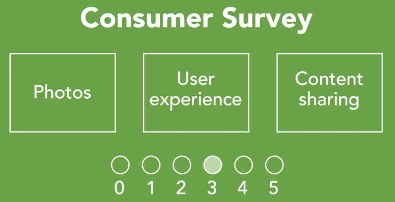
For example, in the user experience bucket, we wanted to assess the most important platform for the product's first release. So, we asked users to weight the importance of three different environments, mobile, desktop, or virtual reality, which could revolutionize social media.

Life is full of options. So are new ventures. Conjoint analysis, with the sort of data that our survey provides, can help us to know where to focus our resources to ensure traction. One category you'll see in the data is one called differentiation. Now, this is our client's social media special sauce, if you will. It's a bucket of innovative ideas that no other player on the social media space has brought to life yet. They could all be amazing, but unless the world is excited about it, it'll be a flop.
So, what we'll see as a result, once our analysis is complete, are the functions this new social media platform should include to have the best chance at making it big.
# Conjoint Analysis with Python
One of the most challenging aspects of running an analysis like the one we're discussing is the design of the survey at the outset. Now, like we saw in the last video, our different combination of attributes and levels created the potential for 486 possible combinations. I don't know too many customers who would rank that many possibilities, let alone even as many as, say, 40. Now, let's go ahead and load in our packages. So first cell, Shift Enter, and I'm using our exercise files for our case study data, so let's go ahead and connect to our data set. And let's do a quick snapshot of what we're working with here, so we'll just type in the variable that we just assigned to our data frame, myConjointData, and I'll run that.
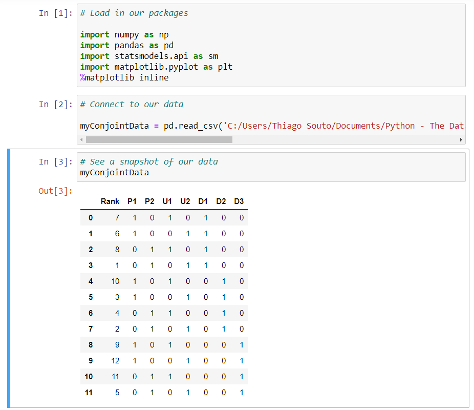
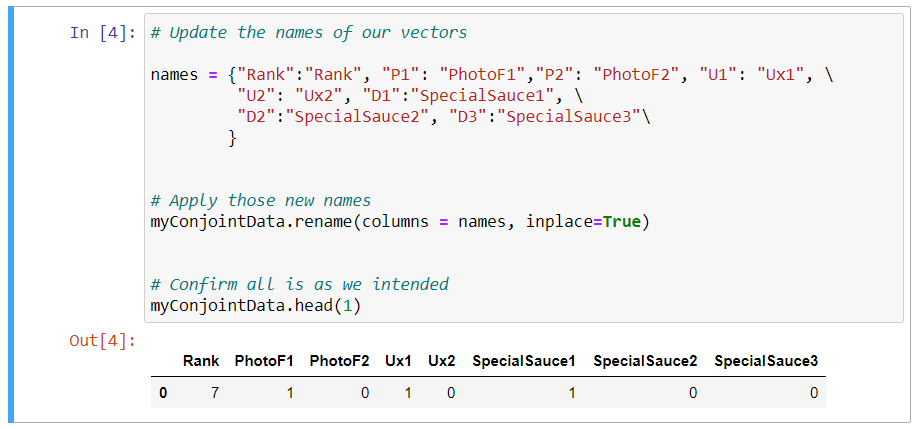
And we can see what we're working with here. Now this may seem like a small data set, but in all reality, there are over 400 consumer responses here, because I aggregated those response rates during my ETL process to prepare the data. Our rank column shows how each of our 11 combinations, in this case, scored. So in other words, this survey study narrowed our 486 potential combinations down to just 11. Our column names are a little bit cryptic, so we're going to do a little bit of data munching here to clarify what those are. And I have my metadata file, so I can add in names that are more descriptive here, so we've done that right here. And basically what we did is we declared a hash table with our descriptive names.
# Update the names of our vectors

names = {"Rank":"Rank", "P1": "PhotoF1","P2": "PhotoF2", "U1": "Ux1", \
         "U2": "Ux2", "D1":"SpecialSauce1", \
         "D2":"SpecialSauce2", "D3":"SpecialSauce3"\
        }
2
3
4
5
6
And next we need to apply those names, so I will do that by assigning our data frame, myConjointData, and running the rename command, and we're going to assign that the names we just declared. And we're going to run this inplace operator, which in essence just says hey, replace the dataframe that we already have established. Then we're going to just run a quick confirmation that this is working the way that we intended, so I'll just print out the first row, so myConjointData.head, and in the first row. So I'm going to go ahead and run that, and so that looks good.
# Apply those new names
myConjointData.rename(columns = names, inplace=True)


# Confirm all is as we intended
myConjointData.head(1)
2
3
4
5
6
We have a statement here that assigns each of those columns with the exception of rank to a variable X, which will represent our X axis in just a moment. So again, we have a variable name called X, we've assigned that our dataframe, and we've now gone ahead and specifically declared which columns of our data we want to belong to this value of X. Now we want to assign a constant to this data to provide our algorithm with a zero-based reference point, or a benchmark, in other words. So I do that this way. I'm going to define X, this function of SM, which we added in our packages, and now I'm going to add a constant specifically to our dataframe that we defined above as X. And then we're going to do the same for the Y and assign our rank, at this point, to the Y. So we're going to do y = myContjointData.rank.
# Assign our test data to the x
X = myConjointData[['PhotoF1', 'PhotoF2', 'Ux1', 'Ux2', 'SpecialSauce1', \
                    'SpecialSauce2', 'SpecialSauce3']]

# Assign a constant
X = sm.add_constatnt(X)


# Assign our resulting test data to the y
Y = myConjointData.Rank
2
3
4
5
6
7
8
9
10
And now I'm going to generate a linear regression model, which really brings us full circle for the course, and we'll fit those values, and so ultimately this is going to produce a multiple regression. So in other words, when we first looked at regression earlier in the course, we plotted one independent variable, but now we're going to plot many, and I'll do that this way. So I'm going to first assign a variable, and we'll call it myLinearRegressionForConjoint, long variable name, but that should do the trick. And then, again, we're going to call this SM function from our package above, ordinarily squares, which you can recall from earlier on in the video, when we first looked at regression, and we're going to apply the Y and the X values, and now we're going to pin that to our fit command. So all of this should be a little bit of a refresher from those earlier videos, and lastly, we want to go ahead and run the summary of that so we can see the output from our regression. Again, I'm going to type in myLinearRegressionForConjoint.summary, and now we're going to go ahead and run this full block of code.
# Assign our test data to the x
X = myConjointData[['PhotoF1', 'PhotoF2', 'Ux1', 'Ux2', 'SpecialSauce1', \
                    'SpecialSauce2', 'SpecialSauce3']]

# Assign a constant
X = sm.add_constant(X)


# Assign our resulting test data to the y
Y = myConjointData.Rank

# Perform a linear regression model
myLinearRegressionForConjoint = sm.OLS(Y, X).fit()

myLinearRegressionForConjoint.summary()
2
3
4
5
6
7
8
9
10
11
12
13
14
15
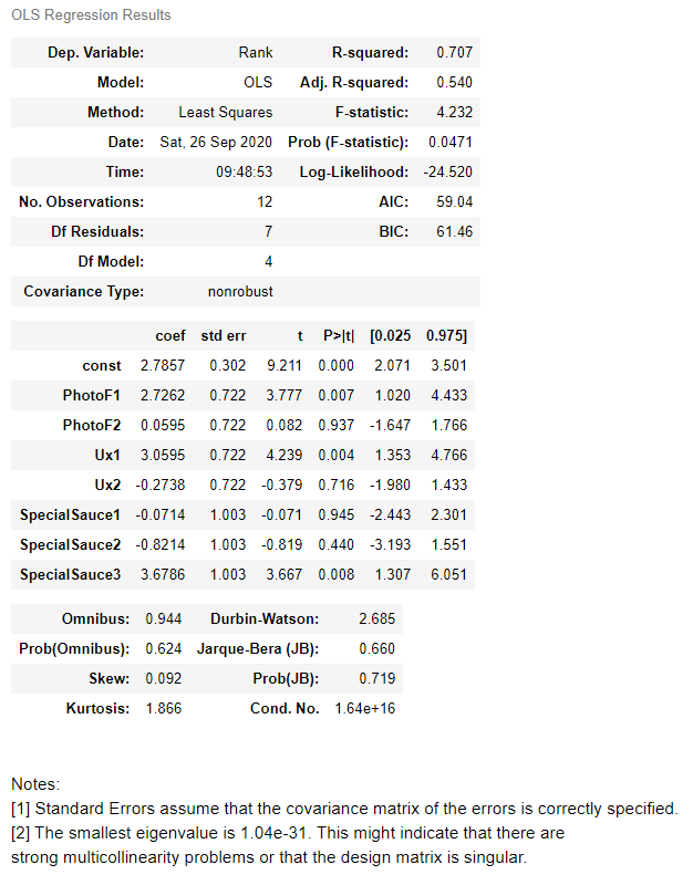
So we received a lot of output. The first output was an error message, so let's read that. This says that this specific function is looking for a value of something greater than 20, or equal to or greater than 20. Again, what we know at this stage of the game, we're using N as representative of 12, that's how many data points we have, but I know this is aggregate data, so we're just going to wave our hands at that statement and just move on, then.
But what we'll focus on for analysis is our coefficients. This is one way we can go about establishing the relative utility, like we saw in the visual from our last video. The higher the coefficient, the higher the relative utility. So of our three different attributes in our seven different levels, if we do a rank order, just by looking at our coef column, right here, that special sauce number three, so this venerable secret sauce for our social media startup, ranks highest, so we can see that at a 3.6. And the Ux1 ranks next in line at a 3.05. And looks like next up is our photo feature one, or PhotoF1.
So what I'd like to do is to summarize my findings here in a quick visual. So we need to normalize this data to allow for us to create a pie chart. We've got a quick formula loaded in here, and we're just going to go ahead and fill in those values, so I'm just going to assign the respective coefficient values that we just identified. So that was 3.67, 3.05, and 2.72. And let's go ahead and run that. And that gives us our values there. And then I'm not going to go into much detail for this last block of code, but essentially, it's taken our input to create a pie chart. So we have assigned the different labels, the sizes we just got back from the normalization of the data, we're also assigning some color and some layout parameters, and then plotting our graph with a little plotting magic, so let's run that.
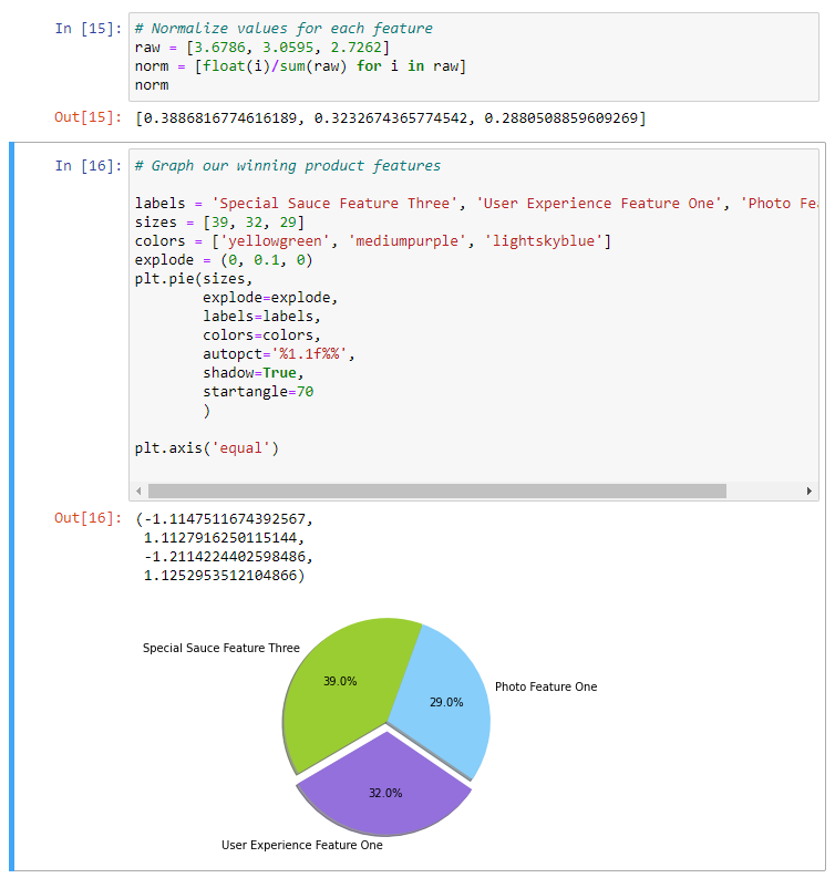
And then we run that and now we have a visual that could represent the next breakthrough for social media.
# Agile Marketing
There are three strategic best practices that will provide you with the right foundation for data driven marketing. The first of these is agile marketing. Agile marketing is an iterative workflow implementation focused on speed, responsiveness, and maximizing performance. It's important for data driven marketing organizations for one key reason.
If you're leveraging the data to make informed decisions about how to drive performance, then you have to be responsive. You have to take action on the data. You have to take action on the insights your data analysis reveals.
Time and time again over the years, I've observed expensive marketing research efforts where the results get housed in a three ring binder collecting dust on a shelf somewhere. This is not the type of data analysis we've been discussing in this course. The shelf life for some of these insights can only be a few weeks, or a few days, or even a few hours. That requires not only a shift in thinking, but a shift in process.
Think of it this way. All marketing consists of three things. Planning, acting, and tracking. The planning consists of strategy, the acting is the execution of your plans and programs, and the tracking is all about analyzing the right data to validate results and find hidden insights. Envision a triangle in your mind's eye. Each corner of this triangle represents one of these three elements. One corner is the plan, the next is the act, and the next is the track. Now, imagine if we were to evolve that triangle into more of a circle. Now the lines and the points separating each element gets blurred. It becomes difficult to see where one element begins and the other ends.
The triangle approach creates a silo effect. Each element exists in its own corner, somewhat rigid. The circle represents an agile approach. The idea here is transparency and responsiveness, and collaboration. So, the question becomes are these three facets of your marketing organization organized in a triangular workflow, or a circular one that is as responsive as it needs to be? If you categorize yourself in the former, you are certainly not alone. It can be a challenge, but there are some great resources out there today to help you learn agile workflow, so that you can bring it into your own marketing group. There are devices like backlogs and sprint plans and standup meetings, and realtime collaboration tools, and these have all gained a lot of traction over the last few years.
The right solution is typically one that borrows from these conventions and does it in a way that is iterative and open, so that you can find the solutions that are best for your group.
# Design and conduct market experiments
I've analyzed many marketing campaigns over the years. Some were performing okay and others less so. My job is to help these campaigns and I find that using an approach called marketing campaign testing provides me with a nice set of tools that guarantee campaign success. Here's one way you might go about doing a marketing campaign test. I call it the MVC, or the minimum viable campaign. Now, the minimum viable campaign is a marketing campaign that invests the minimum amount of resources necessary to validate performance. So that a marketer can see the right opportunities to scale marketing investments and drive growth. Here's how it works. First, you put an MVC road map in place, which includes a hypothesis, stated objectives, requirements for data, and a resource plan. Second, you execute the campaign. And then third, you analyze the data from that execution to determine whether you can scale that program or pivot the effort. Now, you can take this approach with any channel and any campaign. You can do it with traditional media, social media, digital media. You can test creative messaging, call to action. Really any other variable you can conceive of.