# Minitab
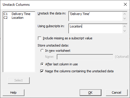
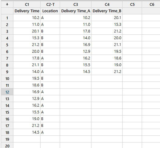
To add data into Minitab we can copy and paste from excel in the Worksheet window. In the example below we import Delivery Time and Location from a file and we unstack data using Data -> Unstack Columns.
TIP
Worksheet holds the data only. Project contains the worksheet and all the work completed during the session such as generated analysis, graphs, and results.
Worksheet does contain the date solely. Project contains all the data including the process and results generated during the Minitab session.
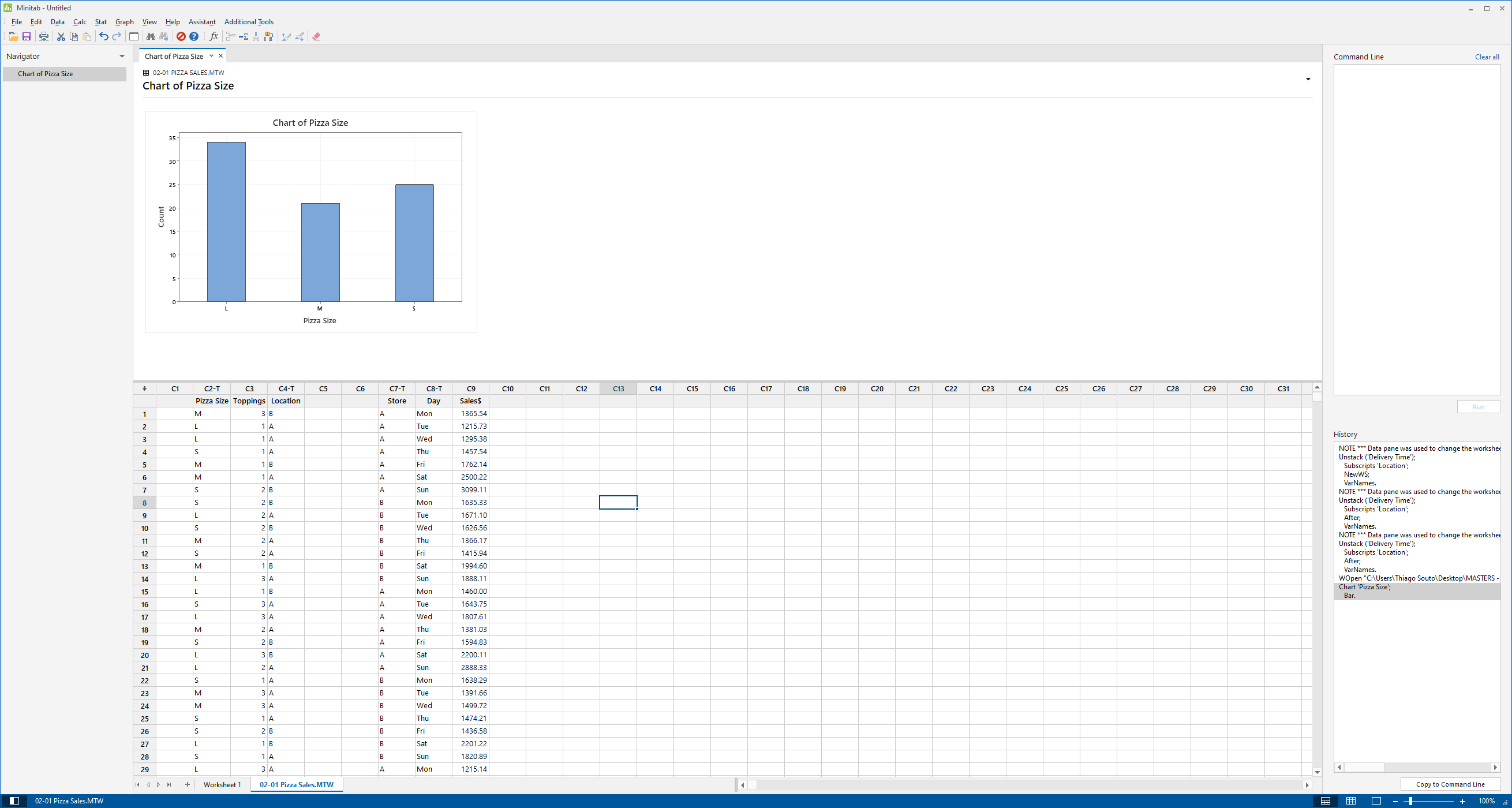
# Bar Charts


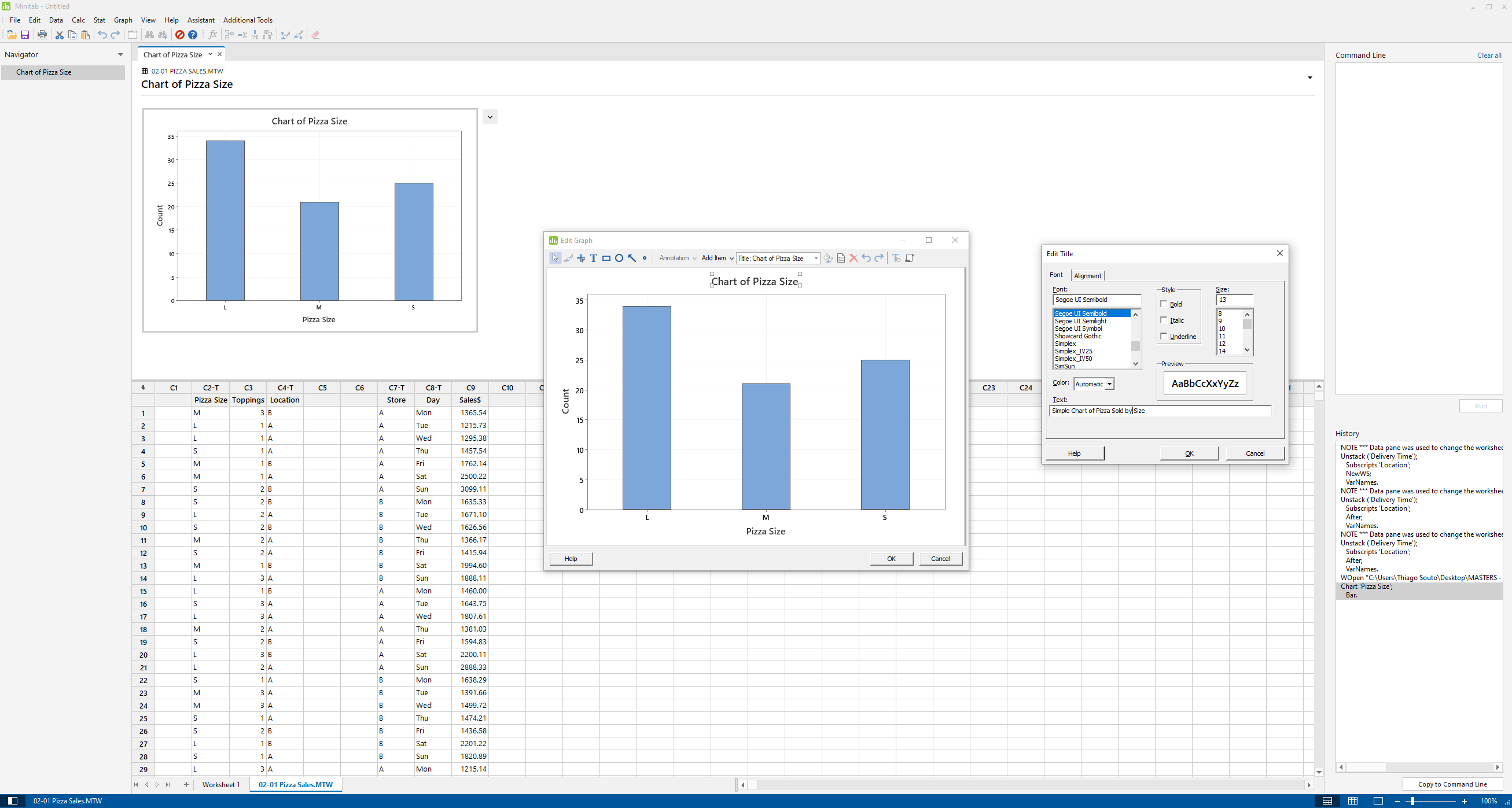
Of course we can edit the title:
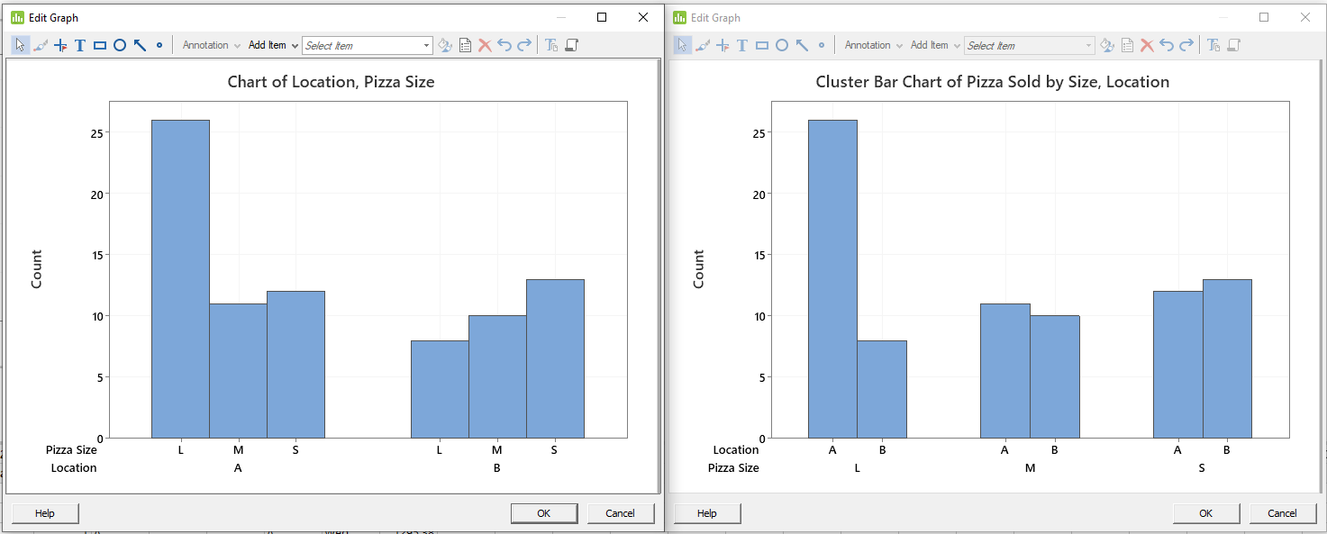
We can also make Clusted Barcharts

Or Location first

What's the difference? The difference is what business question is being answered? Over here, we are comparing for each size, which store sells more. In the case of the large sizes, A sells more than B. In the case of the small sizes, B sells more than A. Over on this chart, even though the cluster bar chart also, we are answering a different question. Meaning what is a breakdown of the sizes sold at location A, versus location B. We can see that the highest number sold are large pizzas as far as location A is concerned. Whereas in location B the highest number of pizzas sold is the small size category.
What if your interested in a total number of pizzas sold at location A, with the breakdown of sizes at each location? If the sum total is of interest to you, then the stacked bar char is more appropriate. So let's create a stacked bar chart. Go to graph, bar chart, stacked, location and pizza size. Notice here that the category that is last is the one that's being stacked. In this case we have pizza sizes being stacked at each location.

TIP
CTRL + e for last dialog box
Stacked Bar Chart of Pizza Sold for each Size, breakdown by Location:
So we have large,medium, and small pizzas being compared total sold for both locations for large pizzas versus medium versus small. And then for each one, we have a breakdown between the two locations. As you can see in all the large pizzas A dominates, whereas for the small pizzas B dominates.

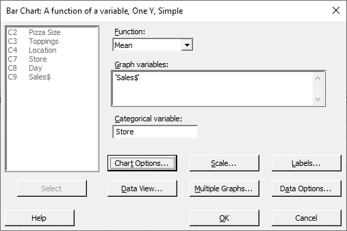
I've shown you how to do bar charts with count data in this case, the number of pizzas sold. We can also do bar charts for continuous data. Such as sales dollars, so let's do that. So if I'm going to compare the total sales or the mean sales store A versus store B, I can do that. Of course it would be a function of a variable instead of an actual count.
So go to graph, bar chart, so we choose function of a variable, we can do total, we can do mean, we can do averages, or medians. Let's do a simple. Let's choose mean. As you can see here, various calculations can be done, but let's showcase and display means. Means of the sales revenue compared across the variable being the store.

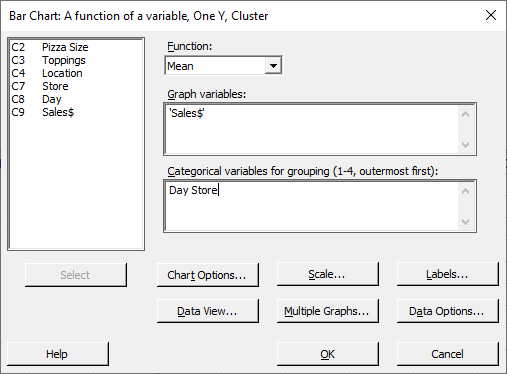

Cluster Bar Chart of Mean( Sales$ ) for each Store, breakdown by day
# Pareto Chart with Standardized Effects
Stat -> DOE -> Factorial -> Analyze Factorial Design ->
# 4 in 1 Residual
Stats -> ANOVA -> General Linear Model -> Fit General Linear Model -> Graphs -> 4 in 1
# DOE
Stat -> DOE -> Factorial -> Analyze Factorial Design ->